
Analysis of a Static Image
Core Value II of the Writing Arts Department emphasizes the importance of Information Literacy, a phrase more expansive than Literacy, which we ordinarily associate with written texts, the ability to read, write, and interact with language.
Your Guide to the First-Year Writing Program devotes a large section to a full description of the components of various media (including visual media), from which this is an excerpt:
Core Value II: Close and critical reading/analysis is necessary for listening to and questioning texts, arriving at a thoughtful understanding of those texts, and joining the academic and/or public conversations represented by those texts.
Writers create texts to communicate ideas, and they make specific compositional choices in their writing to achieve their goals. These choices are in terms of language, materials/mediums (physical and/or digital), and other compositional elements, including typography, layout, design, images, sound, editing, and more. As readers, we must analyze these elements to determine the authors’ meanings, as well as the ideologies that have shaped the ideas and how they are expressed/presented through texts. Readers engage with texts not only to understand their meanings and listen to other authors but also to question them.
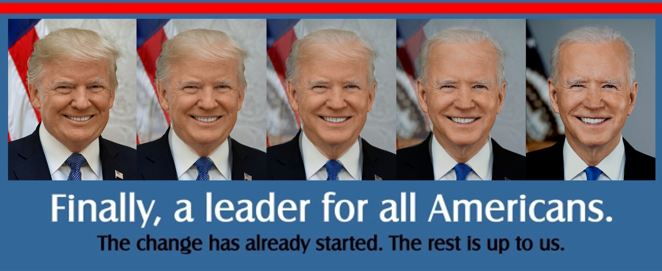
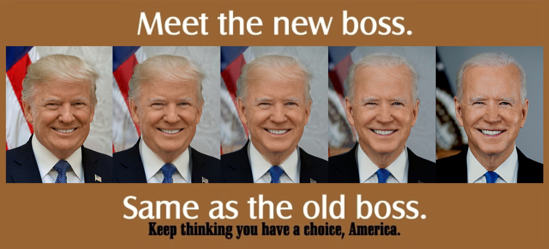
We’ll begin that practice today by examining the header image for our class blog, the set of photographs that morph former President Donald Trump’s official photograph with that of current President Joe Biden’s.
You’ll notice, of course, that the images get weird toward the middle, where an unholy alliance between the two men results in something nobody would willingly elect: a 50/50 Donald Biden or Joe Trump.

As an image without context, it can mean whatever the viewer chooses for it to mean.
- It could be used, for example, to demonstrate how similar America’s presidents are or choose to be portrayed. The somber suits and blue ties, the choice of patriotic backgrounds, the straight-ahead poses and big-toothed smiles are apparently part of how presidents choose to see themselves, or how Americans choose to see our presidents.
If you were doing a research paper and discovered this image while scouring the academic databases of scholarly articles, you would consider it a “source.” The methodology of this course, after finding sources, is to ask and answer two questions:
How effectively did the author USE this material to demonstrate a meaningful and clear claim?
How can I respectfully use this material to demonstrate
my own meaningful and clear claim?
As a class of 22 students and 1 professor, we might answer the first question 23 different ways, depending on what claim(s) we thought the author of the graphic intended to make.
Further, if we each decided to incorporate the graphic into visual/textual arguments of our own, we might produce 23 different arguments. Let’s look at two and answer the Big Questions about them.
.
Of the two, which seems the more reasonable interpretation? Is it clearer now which message the creator intended? Or can the image be used equally well to convey both messages? What does this tell you about the power of images? What does it say about the power of language to frame how we experience what we see?
In Class Exercise
As a Reply to this post, argue for the effectiveness of each of the static image “posters” above. Then use each poster as a source to make your own claim about America, or elections, or the presidency, or these two presidents. In other words, answer the two questions about each of the two posters.

I think that the second visual is a better example only because the first one can be interrupted in different ways you could see it as we switched to a new president so change is now here or it could be the mixture of both presidents is the change that’s here. Whereas the second one you can clearly understand that the author is trying to say no matter who we choose to put in office its really just the same person.
LikeLike
I feel like the brown image conveys the meaning of the image more showing that most politics are similar and that, either way, we pick some people who aren’t going to be happy. This shows without words people can make easy assumptions about images.
LikeLike
I think the message and the effectiveness are more prevalent in the first image. The second image causes a divide and I’m not digging the message although it’s effective depending on the reader.
My claim about the image: We really aren’t as different as you think, America doesn’t have to be as divided as we are right now. It’s time for compromise.
LikeLike
Personally, I find the blue image to be more effective in conveying what it means. It presents the two as being similar, and clearly argues that we should not be looking to the president for effective change. The second image vaguely blames Americans, without proposing any plausible solution. I also am just not a fan of the wording, “Meet the new boss, same as the old boss” doesn’t make a lot of sense to me.
LikeLike
I believe that the effectiveness of these posters varies on what side you lean towards politically. For example, democrats can feel more effected by this poster than republicans or vise-versa. Each poster is trying to speak volumes about how the country is electing the same people, and that doesn’t show much diversity.
LikeLike
For the first image, it argues the effectiveness that the combination of the two presidents would be a fit for all Americans. For the second image, the effectiveness of that image is arguing that America did not change up to now. I think the first poster would indicate that these two presidents are a bit different in policy but the power of both their ideas would benefit all Americans. The second poster claims that not much has changed, and that the 2020 election did not make a whole difference. So would there be much of a difference if Biden did not get elected and Trump won a second term?
LikeLike
I think that the first claim is less clear about its message, because it implies that the image of the middle of the combined presidents is the best person for America, but also says the change has already begun. I am not sure if the change is represented by the middle image or the other images. The second claim is much more clear, as it demonstrates how similar the presidents are from one another and how we have the illusion of choice. However, the second claim is more controversial and you may or may not agree with it depending on your political views.
LikeLike
I would argue the first image is a more reasonable use of this. The second, however true, seems like such propaganda since it is directly referencing the specific presidents pictured, and their appearance as looking very similar. The first is just referencing the IDEA of a Republican and a Democrat, and the division between the two groups.
LikeLike
I would say the second picture has better rhetoric that it’s successfully portraying. The first doesn’t make sense because it says finally a president for all Americans and the president in question looks exactly like all but one of the previous presidents before. I think the second picture does a better job of portraying the distrust they feel and want to spread.
LikeLike
I personally think the second image is more appealing than the first. The first image has a very broad idea to be discussed between viewers. I think if a point wants to be made…the second image has a better sense of how similar the presidents really are to each other.
LikeLike
I think the second one is easier to understand, and it makes sense whereas the first one can be interpreted in many different ways. The second one shows them merging together and not looking too much different making the claim that the new boss is the same as the old boss seem true. The first one is a lot more controversial, and you can see it as the combined presidents would make a good leader or you can see that Biden is better than Trump.
LikeLike
The first poster is using the pictures in a positive way and the second poster is using it in a negative way. I believe that the second poster is way more effective because the text fits the pictures properly while the first one you could just have a picture of Biden and not need the rest of them for what the poster is saying.
LikeLike
The second picture makes more of a mark and has a better rhetoric. The first poster is a little unclear on what it’s trying to get across because of the blended images and the message that comes with those images not quite relating to what’s going on in the images. While the second picture makes a clear and accurate claim that the message fully supports and accurately depicts the image.
LikeLike
The brown image is a more political look at the image and the first image can be depicted in different ways because of how vague The first image is. I believe the second image is more convincing.
LikeLike
I believe the second image seems to be more of a reasonable interpretation that conveys a stronger message about American than the first image since the creator did not really manipulate Trump and Biden’s image that much. It just proved to show that the two presidents are so similar that they are almost identical. This image tells me that that images are strong enough to send a message to a nation. If presented correctly, they can stir emotions within people and make them think. The power of images may also help people look at experiences differently than how they saw them before.
LikeLike
The brown image conveys a more negative view towards the image than the blue image’s message. In the brown image the message spoken is pointing at how our politics may seem different, but in the end, they truly are the same. The blue image’s message can be viewed as positive outlook because it is pointing at a change in our system that could be positive. Both images show certain mindsets that people can have retaining to the politics of our country. These mindsets have been developed After reviewing both I believe that American politics and elections will only create a divide amongst people with each party only caring about themselves and the policies they defend. If you only care about yourself and not your people, you are no leader of the people.
LikeLike
The poster is effective as it shows how the presidency put the same person in office, despite the public believing that elections truly matter. The bottom poster’s analysis shows the danger that the United States faces as a nation. The nation is so divided that in each election we vote for someone we perceive to be “different” from the last, but they are the same. They continue to divide the nation through by spewing hatred towards the other side by stating that the opposition hates America. This is the danger and few realize that the presidency is pulling the nation further apart. The top poster shows what the United States needs: someone who can bring unity. This poster shows that what the States need is a president who can unify both the left and the right.
LikeLike
I think the image with the brown border seems like the more reasonable interpretation because it gives a clear message about the power of politics, the political system, and the type of people who become president. The power of images can be really strong and impactful, as well as the use of language. Since the image with the brown border says “Meet the new boss. Same as the old boss.” we can understand what the creator intended by that message. There is not much of a change from our old president to our new president, and the second image portrays that.
LikeLike
The first poster is more of a message saying that now there is a change, how are you going to use this opportunity and how. The change of presidents is a sign of change and you need to put energy to make that change to use. The second poster, it’s more of an opposing vibe, with the change of president the poster is giving vibes of a wake-up call to take have change and not just repeat the same cycle every 4 years
LikeLike
I would argue that the first poster isn’t as effective as the second one since the first poster can be confusing to the audience on what side they are on. I think the picture of the first one can be seen as these two presidents merging together instead of having only one president running for office. I think the second is clear about what they are getting across in the state that another president is entering the office but just because they are from a different party doesn’t mean America as a whole as to be divided.
LikeLike